I challenged myself to come up with a way to visually communicate the sequence of Night Mode recordings and releases, and the result is below.
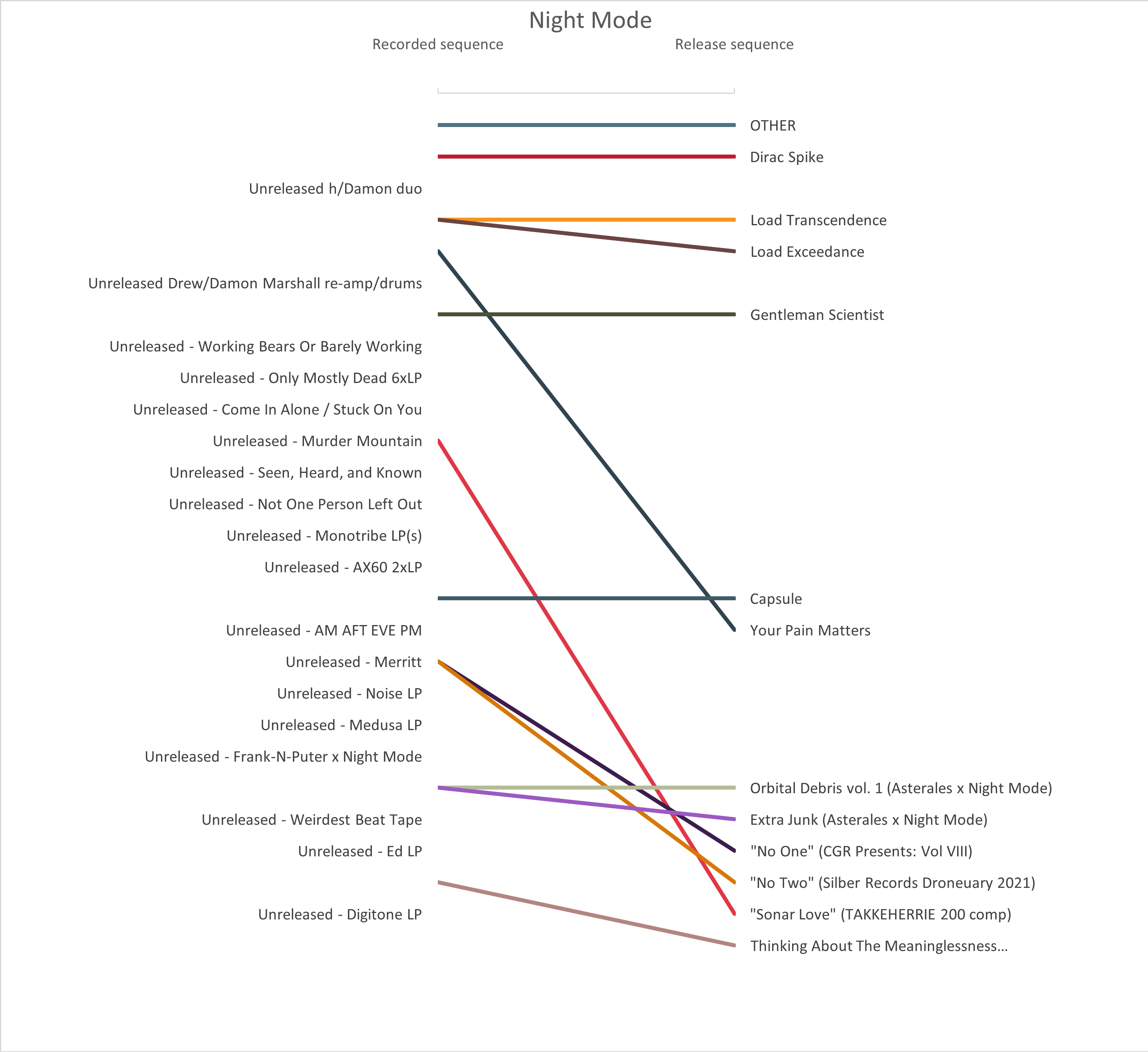
OTHER was first recorded, and first released. Dirac Spike was second. So far, so good.
Then Damon and I made a collaborative album that’s finished, but hasn’t been released. In this chart that means it has an entry in the left side “Recorded sequence” column, but no line (because it doesn’t have a “Release sequence”).
The line for Gentleman Scientist was tough to place, but I went with its approximate recording sequence based on when Drew started working on it. This chart displays sequence only, not absolute time; there’s six months between Load Exceedance and Gentleman Scientist, then only one month from GM to Capsule even though the visual gap is larger. This choice prioritizes the story of artistic development from project to project over an accurate depiction of the passage of time.
You can see from the angled line how Your Pain Matters was recorded early but not released until much later. In contrast, we put out Thinking About The Meaninglessness… very shortly after I made it (shown by a nearly-straight line).
Our recent appearances on compilations with “No One,” “No Two,” and “Sonar Love” were sourced from the unreleased albums “Merritt” and “Murder Mountain.” They’re b-sides, not album tracks.
I did this in Excel, with a lot of customization of the data labels.